O Elefante Gilberto: Picture Book Illustration Process
- Júlio Castro
- Oct 17, 2025
- 10 min read

Updated: Oct 20, 2025

Gilberto the Elephant, written by Sónia Godinho and published by Alfarroba, is now available in its second edition!
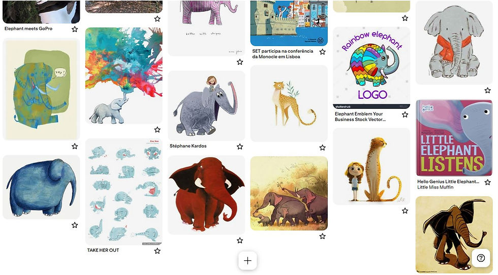
The story is about Gilberto, a gray elephant who feels out of place in his herd and sets off on a journey around the world, seeing different colors and forms of life.
I'm sharing my illustration process for this book. From the first sketches and storyboards to the final layouts, through revisions and finalizations. It's a journey with many parallel and unexpected paths.
I'd love to hear your comments!
Part One: Reading the text, interpreting the mood, first ideas and sketches
I was immediately drawn to the character's journey. Restless and curious, he feels like he doesn't fit in where he lives and wonders why he can't do/be different. It's a story about someone who can't find his group or who is discovering himself. On the other hand, there's inherent humor in seeing an elephant in unusual situations, like early on, when he travels to Spain and participates in the traditional La Tomatina festival, where he discovers red, a color that belongs to him from then on. Thus, successive journeys, encounters with characters, and additions of color occur, leading Gilberto to a very different ending than he began.
In the beginning, I didn't worry about defining anything; it's an open-ended phase. I focus on capturing ideas; elements emerge that can complement others later. As I imagine the scenes, I experiment with compositions seen from different angles.


For this project, the publisher had some briefly sketched out scene ideas and was quite open to any changes. I used some of these as references, and for others, I chose to create different structures.


Part Two: Storyboard, Pagination, and First Submission
From small pencil sketches, I cut out the elements and composed the scenes, unfinished because the intention was to send them to the publisher and receive their comments, so we could discuss and refine them.
When I create the storyboard, from the beginning, I keep in mind the importance of leaving enough space for the text and the position of the elements in relation to the page fold, as important details or elements can be "swallowed" in the center by the binding.
For example, in scene 5, I placed the tank with the orange juice on the right-hand page, separate from the elephant, so that when the reader turns the page, they also have the impression that the tank is turning. At times during the project, I come up with little jokes and winks like this that involve the physicality of the book.


In scene 9, I considered making the elephant larger, taking up more space on the page, but then I concluded that the main idea was to convey the sense of calm and tranquility associated with green, so this color should prevail. To achieve this, I opted to make the scene less literal: not at all proportional in terms of size, the trees serve as cushions, and the elephant lies back as if in a giant bed, very relaxed and comfortable.


In this project, I paid special attention to colors, as they were important to the story. I made sure there was a transition in the following way: before each double page with the highlighted color, this color was introduced on the previous right page.

Well, that's how I defined the elements and actors that would appear in the story and sent it to the publisher.
After this conversation and a few adjustments, I had all the sketches ready. Now the next step was to work on the final artwork.

Part Three: Final Art, Variations, and Improvisations
Kenya - Start and End
Many ideas and definitions emerge after the storyboard. Although the scene is assembled with semi-arranged elements, there is still room for improvisation, as explained below.
In the first scene, the main character sets off on a journey and ultimately returns to his "home" in Kenya. The editor liked the idea of showing the same setting in both scenes, so I felt it was important to somehow emphasize the passage of time, marking the before and after.
In these two scenes, I focused on the characters and their attitudes toward Gilberto's dreams of becoming a colorful person.

With that in mind, I looked for some references of elephant characters that could express different emotions and imagined a trio of adult elephants with different personalities and reactions to Gilberto's excitement and curiosity about colors.
At the beginning of the story: expressions of impatience, disdain but also curiosity.


And in the end, amazement, surprise, and wonder. Some admire him, while others, shocked, continue to believe there is only one "right" way to live.
Spain - La Tomatina
In the following pages, we'll travel to Spain during the La Tomatina festival. I've never been there during the event, so I looked for references in photos and videos to get a feel for the atmosphere. This also happened in most of the scenes.

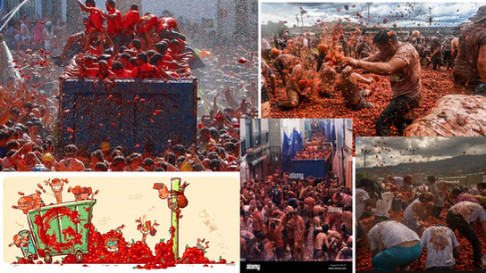


The meanings red conveys to Western audiences are excitement and passion, but it can also evoke violence. I took care to ensure the characters were clearly having fun, not fighting, as can be seen in this drawing and the first painting of the scene, which I later finalized digitally.


Here, I've represented in multiple ways what Sophie Van der Linden defines as "instant movement": a moment representative of the complete action. A person bends down, picks up a tomato, and throws it. You can represent the moment before the throw with the arm bent, the forward momentum with the tomato, the bending again, etc. It's like an action photograph.

Portugal - Orange juice
The next destination was Portugal, first among the orange groves and then Lisbon.
I wanted to highlight the texture of the oranges, convey some of their brightness and acidity, and do justice to the fruit that literally leaps out at you when you peel them.
I initially drew pencil and dry chalk over the watercolor painting. I didn't like how it turned out, so I decided to do it on a separate sheet of paper and put it all together later.


I created the texture of the trees from a painting I did about two years ago of a very cloudy beach.
It's quite upbeat, as you can see below. I colored it in Photoshop and really liked it.


On a regular sheet of paper, I made the oranges and then positioned them as I wanted, creating a layered pie.


I created the following double-page spread in a similar way, but this time I also used acrylic for the orange peels. Once again, I ignored proportions, wanting to showcase the textures I really liked, so I chose to create giant oranges. I believe my work with prints influenced me; the background of this scene turned out more like a print pattern: flat and without perspective.


Final double page:

After winning each color, Gilberto always encounters another character who guides him to the next color and location. This time, in Portugal, I decided to have this encounter take place at the Belém Tower. Considering the primary audience would be Portuguese, I was more specific in the design of this famous location.

Once again, I followed the layered method: lines, paint, textures, and background elements created on different sheets and layers. About two years ago, I worked on a book about sheep traveling on a boat at sea, and I really liked the results using this same method. At the time, I was in a engraving class, and this greatly influenced this idea, as I was seeing how color prints were created using a separate matrix for each color, similar to Photoshop layers.

Australia - Yellow Desert
Gilberto is a traveling and playful elephant. As soon as he arrives in the Australian desert, he plays and rolls in the sand, so I imagined how the animals would react to such a large visitor kicking up so much sand. I looked for animals endemic to this area that seemed like fun, entertaining characters.


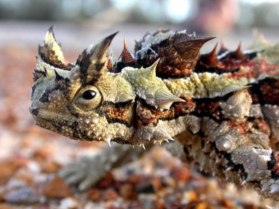
Thorny devil (Moloch horridus) Cute and at the same time, with a look like he was irritated by something

Emu (Dromaius novaehollandiae), Australia's largest bird and the Pinnacles in the Western Australian desert

I really like animation; I studied it at university as part of my Design program, and I plan to work on personal projects whenever possible. As a kid, I used to watch a lot of Cartoon Network while vacationing with my grandmother in Pelotas, and this part of the book reminded me, above all, of Coyote chasing the Road Runner (Looney Tunes), kicking up a lot of sand and making lots of faces. Those scenes were incredible. At the time, I didn't understand why I liked them, but now I see how stylized they are, and I love it.


Road Runner and Coyote and the scenarios: https://tralfaz.blogspot.com/2021/04/scrambled-aches-backgrounds.html
These animations weren't something I'd thought of or sought to reference when I was drawing, but now, after some time and reflecting, I see a strong connection with this bird, the desert, and these elements. References often manifest unconsciously; I tend to think of it as similar to constantly cooking soup for years: I add ingredients to the pot in my head, and for moments I pour myself ladles of this broth and taste ingredients I can't even remember when they were added. My taste buds also change, and certain things just don't sit well anymore.
Details of the finished illustration:


I imagined a kangaroo quite agitated, since they don't walk, but hop. He wanted to help, but he just seemed very nervous and rushed. So to create the illusion of restless movement, I left the lines of the first sketch unchanged, a quick and agitated line. I'll comment more on movement in the still image later.


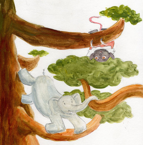
Brazil - Amazon
This time I wanted to create a different, denser texture. I thought of a dense forest and used acrylic this time. I hadn't been to the Amazon, so I recalled the times I'd hiked and ended up at the end of the day with the lights already yellowed. The sun passing through the branches, the calm of listening to the wind, the birds, and the water running in the distance.


I painted the background and then added the elephant, which I painted on another sheet, and some details like the foam and the color stripes.

Here there was a change of actors, he didn't feel comfortable posing upside down and we had to change.


Hawaii - Jumping into the blue sea
I wanted to create the sensation of the character jumping into the sea, the illusion of movement in a static image, which can be achieved in a variety of ways.
Well, in Gilberto's case, this was the result. This scene is a combination of simultaneous succession, which, according to Sophie Van der Linden, consists of recreating and stitching together several fragments of the action that occurred in a single image, and the vaporous effect at the beginning of the jump. Below, I show other examples where I used this.

In this book I illustrated previously, I used movement lines to mark the dog's trajectory and the goats' direction. It also presents a simultaneous sequence: the dog's progressive positions as it circles the herd of goats.
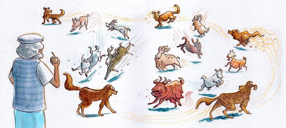
Similarly, in this book about soccer, in addition to the lines, I apply the vaporosity effect to the ball (a strange name for something you've probably seen many times). Both are common in comics/mangas, for example.


Lines of movement and vaporous effect on the ball
In photography, the illusion of movement and succession is also created through the multiple exposure technique.


China - Purple Plum
I tried painting using the Rebelle software, a somewhat new tool for me, and I liked the result.


Rebelle (sponsor me, hehe) is the best watercolor and multi-paint simulator I know. The process is actually similar: it's not an application/imitation of the leaf texture that results in a watercolor-like appearance in the final painting. In this case, the painting process itself is the difference, as it simulates the physics of water. There's more control because you can pause time and the water flow, go back a step, erase, etc. It has its adaptations, but for those who like it, it's worth trying.
This entire part of the story was created with Rebelle and Photoshop. I really liked the brushstroke effect. My idea was to reference Sumi-e, a technique that originated in China during the Tang Dynasty (618-907) and later spread to Japan.


Left: Painting by Liang Kai (c. 1140 - c. 1210) and on the right another painting whose author I could not find.
Another reference was Chinese illustrator Jasper Shaw, who alludes to the ancient technique in many of his works.

Illustration by Jasper Shaw 肖楚杰
For this landscape and this construction, I took a park in China, on Meihua Mountain, as a reference. While researching plum trees and China, I ended up finding this place, also called Plum Blossom Hill. It's one of the so-called National Scenic Areas, similar to a reserve or national park.


Lilac - Return to Kenya
This part presented a different challenge, as the color lilac produces a very different result in the CMYK printing system than the RGB we see on screen. I was able to work around this somewhat, as the color initially printed very dull, and the magenta also had to be differentiated from the purple.


CMYK (initial) and RGB
I painted the mountain, the flowers, the "perfumes," and the elephant on separate layers. The scents were painted on Rebelle, and the rest were painted in watercolor, acrylic, and pencil.

On the last page I painted the sneeze/rainbow separately and then made a collage, changed the beginning scene as necessary to show the passage of time and put the elephants to act.


The illustration at the beginning and the changes for the last page
Well, after all that work, the only "detail" left was the cover. I sketched out a few different ideas and sent them to Andreia, Alfarroba's editor.

We exchanged a few emails, and we thought the second option was the best for this book. I drew it digitally, adding the elements I imagined he would carry throughout the story—a backpacking elephant.

I even considered making a silhouette of the landscape on the front cover, as well as on the back cover.

Then I suggested a texture for the white background, so it wouldn't look like a "cold refrigerator white", a good definition, which I found funny, from Andreia.

I painted the footprints, the elephant, and the letters a few times. I put it all together, changing a few colors. It took several attempts because I wanted the lettering to come out untouched, to show off the texture of the brush.


Something I've heard from several designers/artists is that practicing many times, rehearsing, in execution makes it seem like it was done in seconds or that it is easy.


I've been thinking about writing this post for a long time, documenting and sharing my process for anyone who might be curious. I'm always learning from others, and I hope it'll be useful to someone else. In other projects, I've done different things that I plan to post over time. I'm also thinking about posting about techniques and elements of the illustrated book language itself, a topic I'm passionate about.
If you want to follow along on Instagram, writer Sonia Godinho has been posting about the events, promotions, and trips she's been taking with Gilberto. It's been wonderful to see the public's reception, even from a distance. I'm grateful to Sonia for writing this beautiful story that inspired me, and even more so, for the trust shown by publisher Alfarroba, especially Andreia, who we've worked on several books together.
Thank you to everyone who reads.
Greetings,
Júlio
Comments